Published: Dec 22, 2021 by Ivana Žemberi
When designing a logo, there are quite a few things to consider. In this post, I will lead you through those rules and principles.
There are five golden principles of design:
1. Simplicity
Simplicity makes the logo easily recognizable and suitable for icons as small as favicons. If it has too many elements, it can be distracting. For that reason, it is best to have a maximum of three components.
Good logos deliver uniqueness without being too complicated.
2. Versatility
Versatility is a crucial feature for a logo. It means that logo appears in various sizes, from sizes as big as billboards to tiny ones like business cards, pens, and stickers. The logo must be scalable to achieve that.
It should also look good in black and white as well as color. For example, newspapers, company memos, and other printed documents are often black and white. Using a small number of colors makes the logo look better in black and white.
3. Timelessness
When you’re designing your logo, you want it to be timeless. The truth is, it will probably need some altering after a few years, but you want those alternations to be minimal. Research is the best way to achieve that.
Think about logos that you see daily and can’t remember if they ever looked differently. What is the reason they didn’t have to change over time?
Maybe you can’t use the same principles, but it will impact your design in the right way.
4. Appropriateness
You need to know your audience to design an appropriate logo.
If you’re making a logo for some car company, your audience is adults with driver’s licenses. For that kind of audience, you want the logo to look professional.
If you’re designing a logo for a company that makes children’s toys, your audience is children. In that case, you should probably make a colorful and fun logo that will attract the required audience.
5. Memorability
To make a logo effective and memorable, stick with the previously described golden principles. If your logo is simple and appropriate to the nature of the business you’re designing it for, it should be memorable.
In addition to the five golden principles of design, there are a few more factors you need to consider to make the best logo possible.
Company representation
If you google a definition of a logo, you’ll get something like: “A logo is a symbol made up of text and images that identifies a company.” for an answer.
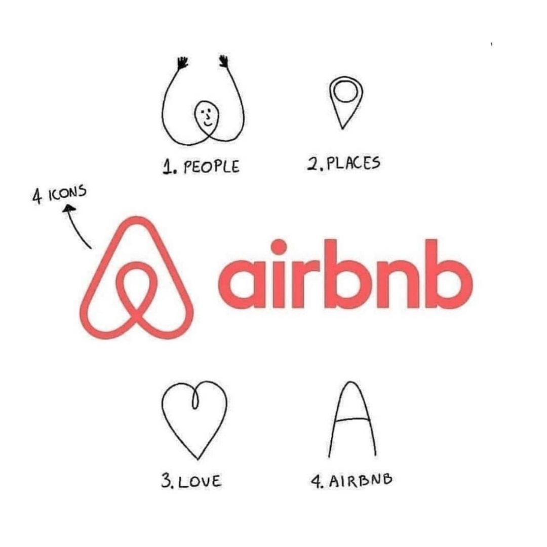
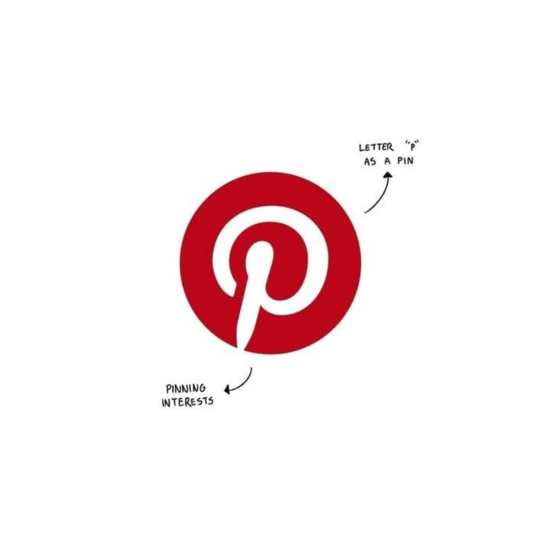
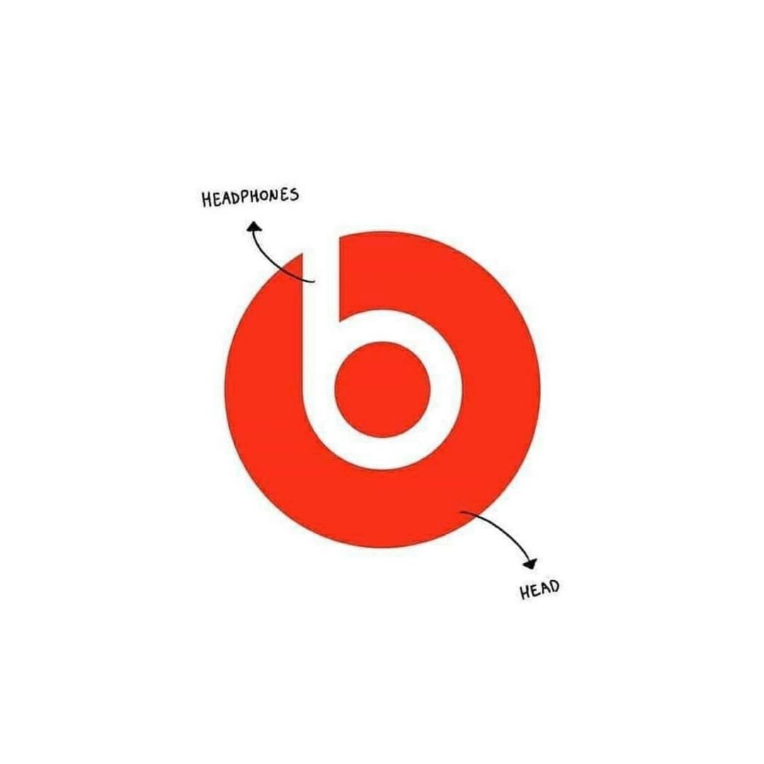
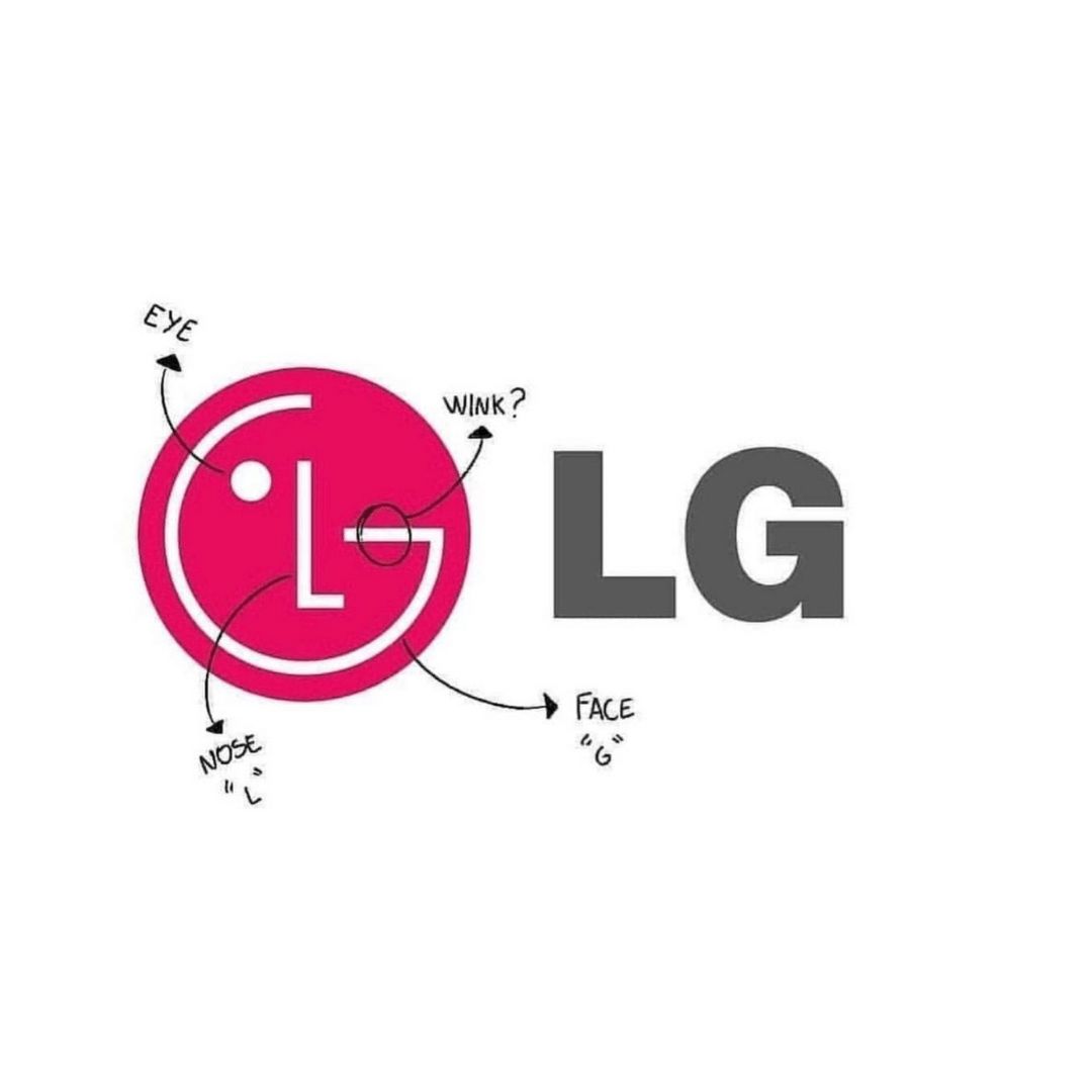
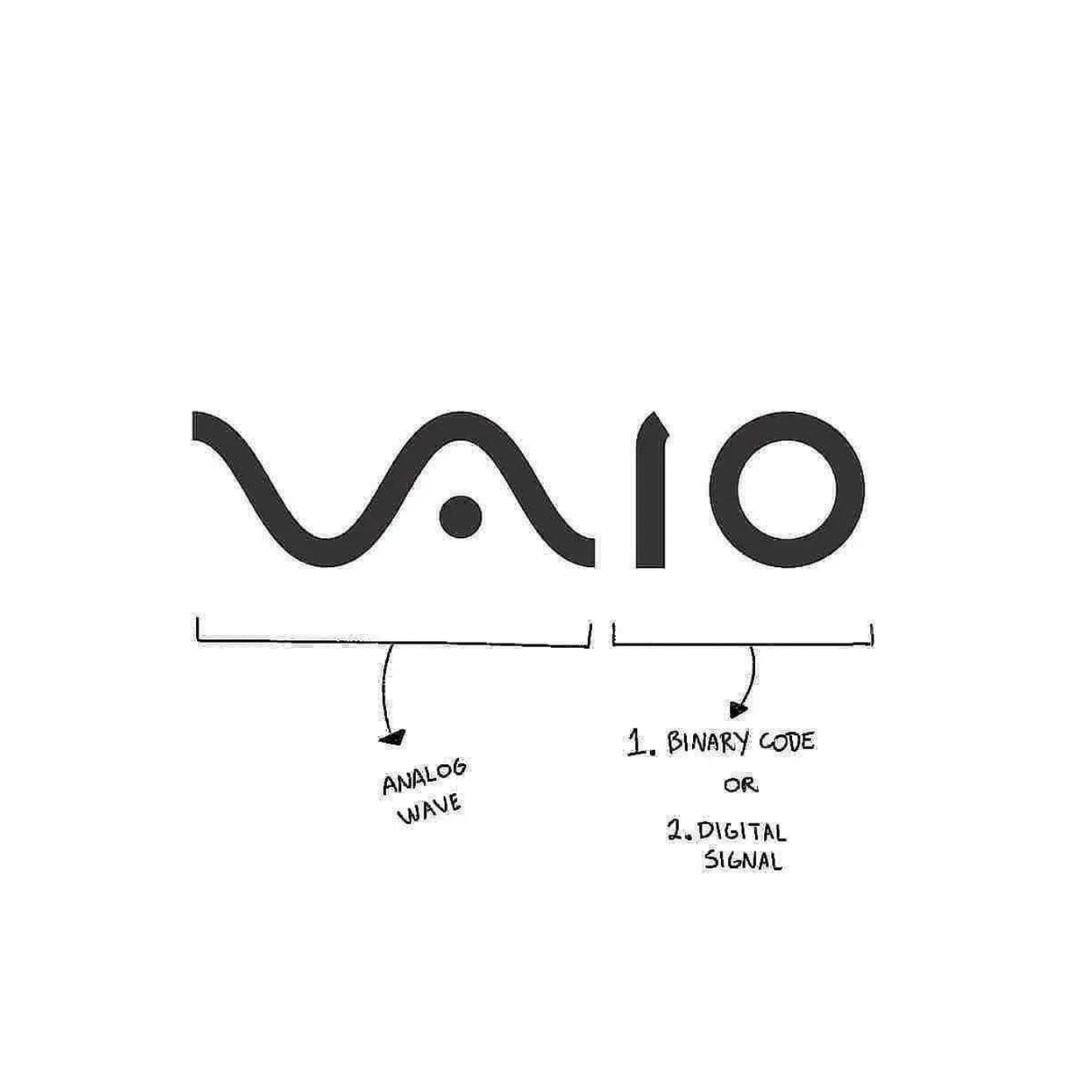
To make a logo great, it needs to show what a company does and what the brand values. The shapes you use for a logo must represent something of importance for the brand. Below you can see examples of some of the famous companies’ logos.
 |
 |
 |
 |
 |
 |
 |
 |
 |
Source: https://www.linkedin.com/posts/nathanbickerton_branding-activity-6853585160156258304-glZf
Research
The examples above represent quality, well-researched logos. Here are some tips on how to go in that direction. There are five main questions you need to ask when doing the research.
- What does the company do?
- Who is the target audience?
- Who is the competition?
- What are the company’s long-term goals?
- Why does the company need a new logo?
The answer to the first question determines which shapes and elements you could use in the logo.
The answer to the second question determines the tone of the logo, whether it should be professional or playful.
The answer to the third question gives valuable information about the competition and the shared audience. It also ensures avoiding unintentional mimicking of an already known brand.
The answer to the fourth question is about making the logo timeless. The company may have goals to expand its services and products. If that’s the case, you should factor those goals into the design.
The fifth question makes sense only if it’s about the redesign. There are several reasons for rebranding and redesign. It could be because of new ownership, new product or service, new management, or new ethos.
In any case, you need to make sure you understand the company’s reasons for rebranding. Perhaps it requires only tweaking the current design, and maybe it needs an entirely different approach.
Colors & Typography
When considering colors, there are some common meanings assigned to them. For example, blue signifies trust, security, and stability. Green represents health, growth, and peace, and so on. But these common meanings are not enough to choose the right color.
Firstly, there are many cultural differences in color definition. Secondly, visual perception is quite individual for everyone. It may be affected by age, gender, or culture.
Perhaps the most important thing when it comes to choosing a color is to consider the color preferences of the targeted audience.
When it comes to typography, you should consider the tone you want your logo to have. Is your logo going to be modern or vintage? Choose the type of font accordingly.
I will list a few font families and what kind of tone they bring to the table.
Serif logo fonts.
- They evoke a polished, classic feeling.
Slab serif logo fonts.
- They are bolder, louder serifs with large letterforms.
- They can be seen from a long distance.
Script logo fonts.
- They are both formal and casual typefaces.
- They have the loops and flourishes of script handwriting.
Sans-serif logo fonts.
- They are considered more modern than their serif counterparts.
Feedback
When you consider all those things, from golden principles to colors and typography, the most important thing is that the client likes your design.
You can make a perfect logo according to all the standards, but if your client’s wishes are not satisfied, you need to be ready to make the necessary changes. Listen to the feedback and write notes so you can remember everything later.
On the other hand, if you strongly think that your client’s wishes aren’t adequate for them and their brand, you need to find a way to explain it to them. Following previous rules and steps should do the trick.
For example, if the colors your client wants are not compatible, explain why they aren’t the optimal choice.
Being a designer has many duties. One of them is to be accepting of criticism.
Another one is to be able to uphold your design choices. That means you should be able to name the exact reasons behind every shape, color, and font you used.


