Roles in the project:
I worked with two other people on this project. The time limit for completing it was two 90 minutes sessions.
Everyone had the same responsibilities which consisted of:- Analysing the assigned website: Aint Wet
- Identifying its problems
- Thinking of solutions for those problems
- Researching popular online shopping websites
- Wireframing: low-fidelity and high-fidelity
- Prototyping: connecting high-fidelity screens into a prototype.
Project Summary
Problem:
Redesign the webshop to be more user-friendly.
Goal:
Make the website look like other standard Online Shopping Websites.
Who are the users?
The users are everyone interested in shopping for shirts, snacks, and similar products online. Most of them are probably from the United States due to the expensive international shipping.
Tools used in the project:
- Draw.io
- Marvel
Research
Because of the time limit, we didn’t have much time for research. Because of that, we focused on just researching the market. We did that by looking at some of the popular Online Shopping Websites.
Key takeaways:
Many of the websites at the time followed this trend:
- using black and white theme
- having navigation at the top of the screen
- having a search bar located in the middle, or the right top corner
- having access to the shopping cart in the top corner (next to the search bar)
- having filters for shopping by categories, price ranges, and such on the left sidebar
- having a copyright sign in the footer
Sketches & Wireframes
After doing the research, we created wireframes for the new design. First, we consulted about the elements that should be identical on every page. Then each team member picked one page and designed a wireframe for it.
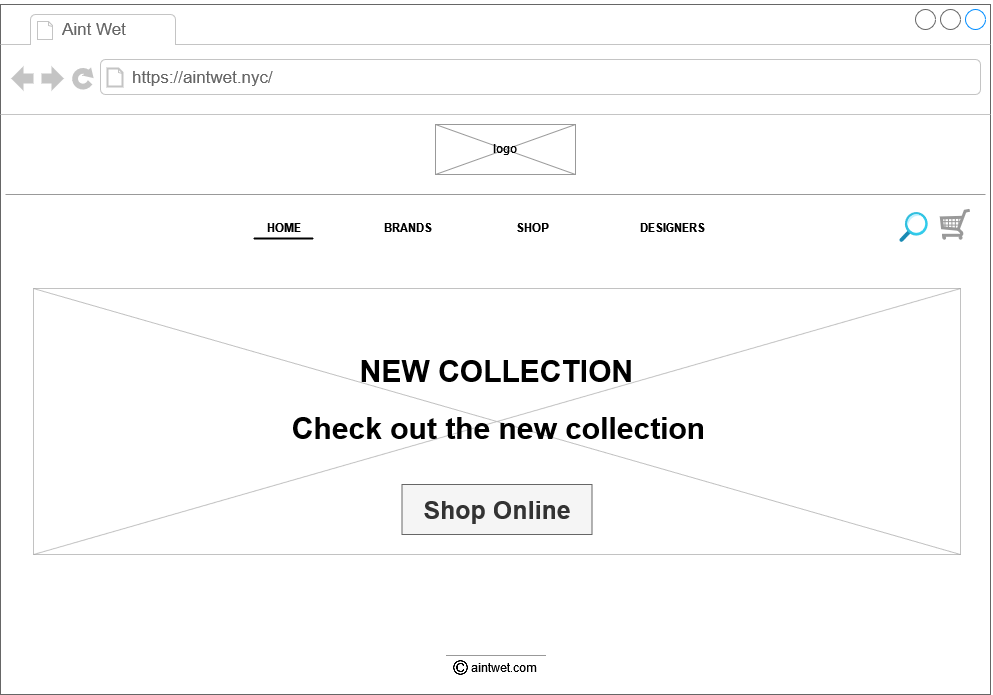
Above is the wireframe that represents the home page of the redesigned website. As you can see, a place for the logo is in the heading. Since the current website design didn’t contain an identifiable logo, we later decided to make one. Below the heading, there is a navigation bar. On the right, there are a search bar and a shopping cart.
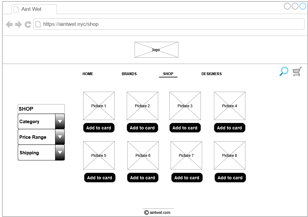
Here is the wireframe that represents the shopping page of the new design. The heading and navigation bar match the previous one. The navigation bar for filtering shopping by category, price range, and shipping is on the left. The buttons for adding to the cart are below the pictures of the products. They are all the same size and evenly distributed.
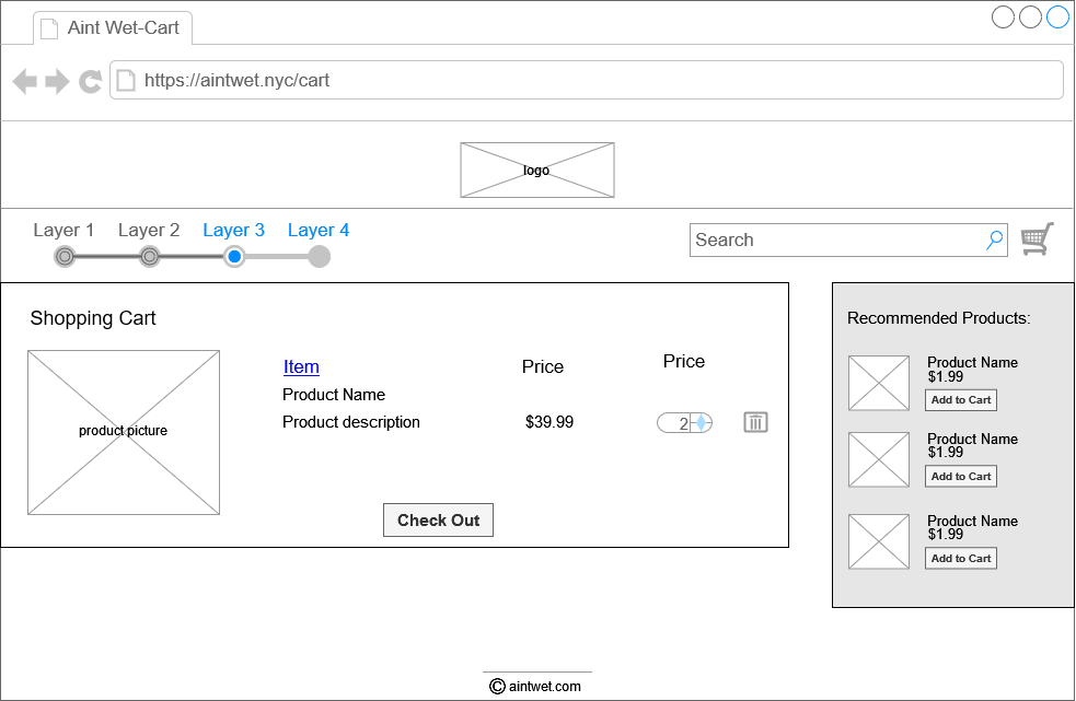
The last wireframe represents the shopping cart. Below the matching heading, there is a progress bar. It indicates how many steps remain until finishing the order. Items in the cart contain product information such as product name, description, price, and amount. In addition to the items in the shopping cart, there are also recommended products on the right side.
Final Design - style guide
People like familiarity. The original website design, although creative, is more likely to cause anxiety when shopping online.
Online shopping should be a safe place where people wouldn’t need to worry about the legitimacy of the page and their credit card information getting stolen.
After creating the wireframes, we quickly designed a simple logo. For that, we used one of many free logo-making websites at the time.
As stated earlier, we chose to redesign the home page, the shopping page, and the shopping cart page. Below are the screenshots of the before and after.
Home page
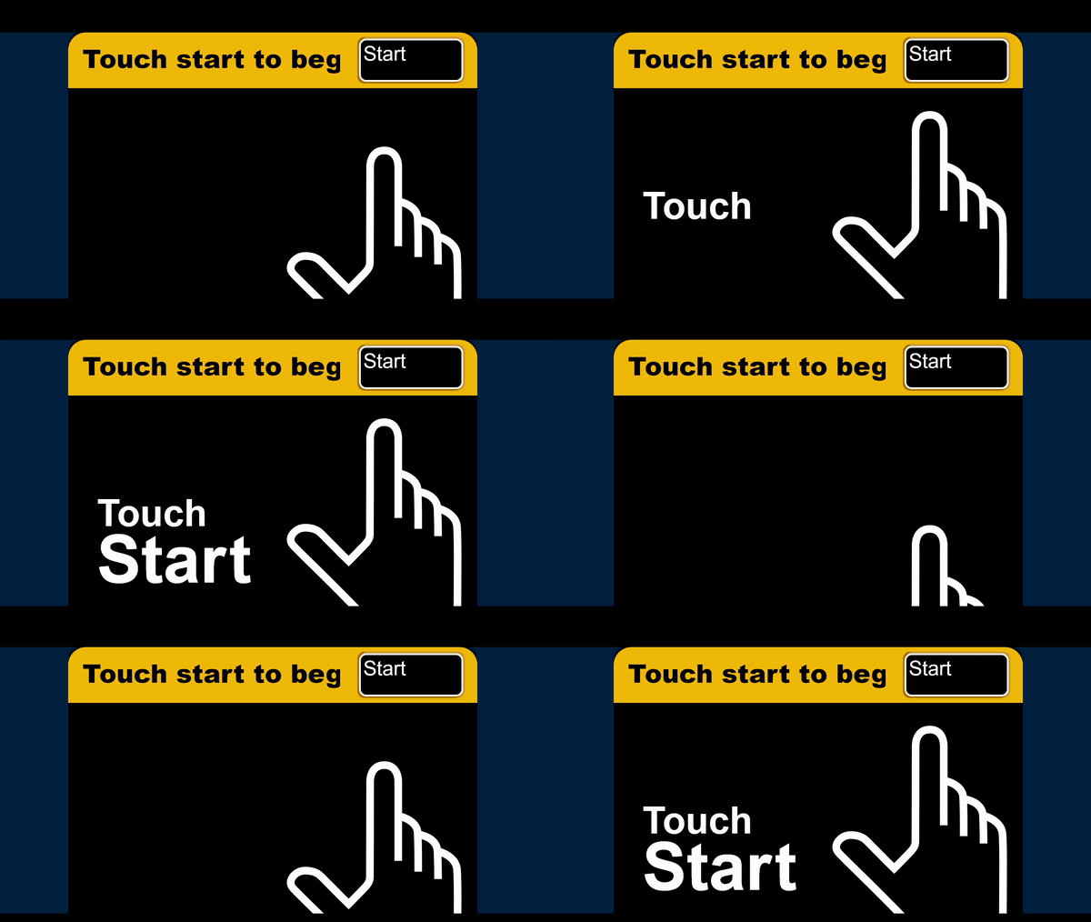
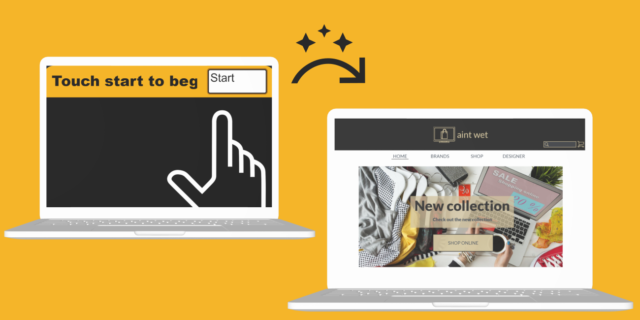
From the first look, there are several problems with the home page. The first one is that the title doesn’t fit the heading. So instead of what, I am assuming, should have been “Touch start to begin”, it reads “Touch start to beg”. The second problem is that there is too little information. Even if the title was readable, the user still wouldn’t know if this was an online shopping site or not. Nothing suggests that it is. The third problem is that the navigation is confusing. There are also problems with responsiveness. The font size is too big, and the animation of the pointing finger makes it look more like a pop-up ad than an online shopping website.
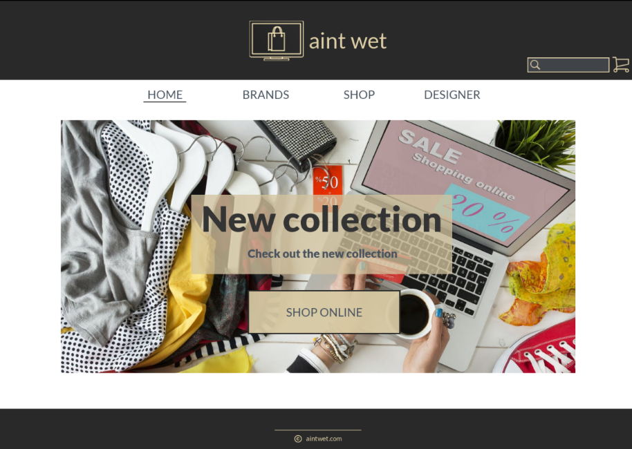
To solve those problems we designed the solution above. This way there is no confusion about what the website is about. The first thing user would see would be the image of clothing items on sale. There is also a button that says “Shop online” which would take the user to the shopping page.
Shopping page
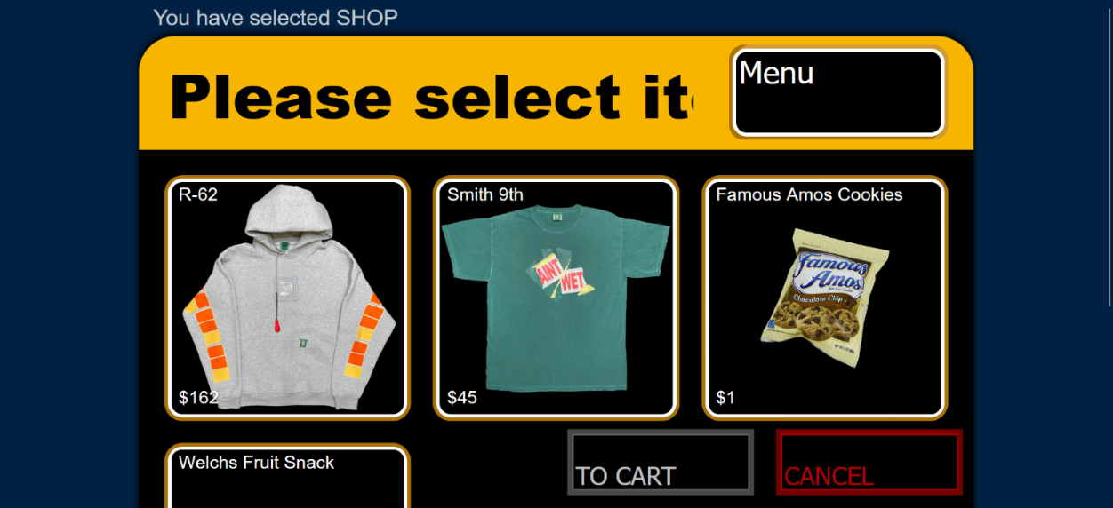
On this Shopping page, there are several products available for purchase. There is also a button that leads to the cart and a button that says “Cancel”. The purpose of the cancel button was not clear. I had to click on it to see what it does, and what it does is it takes you back to the home page.
There is also a problem that you can´t reach your shopping cart from any other page than Shop. In conclusion, the navigation is poor and unclear. The menu in the top right corner is for filtering products by “Shirts” or “Snacks”. However, it just looks like the button that led us to the Shop page.
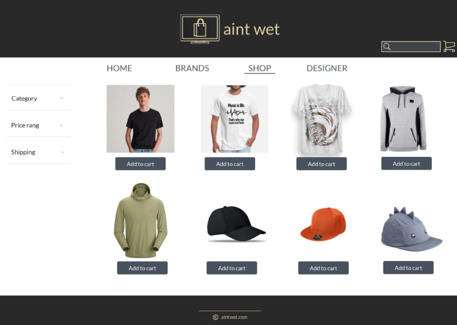
We decided to fix the navigation problem by placing a standard navigation bar below the heading. We also enabled access to the shopping cart from any page. We solved the problem with unclear filtering by putting a left sidebar menu.
Shopping Cart page
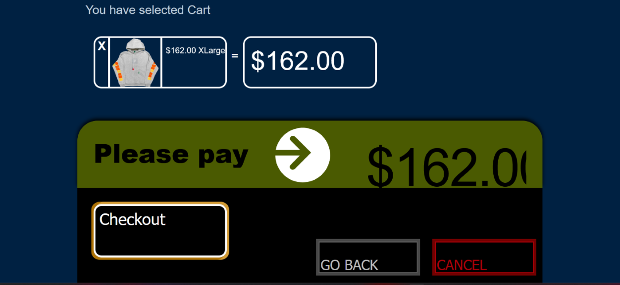
This page has similar problems as the pages above. The colors are too dark, and the red on the cancel button makes the user want to cancel the purchase. There is also an issue with the impracticality of the list of chosen items. They are in the form of an equation. If the user wants to purchase more than two products, the equation of products causes poor visibility of the chosen products. The credit card illustration saying “Please pay” has an arrow pointing to the amount of money that isn’t visible properly. Our approach to solving those problems is below.
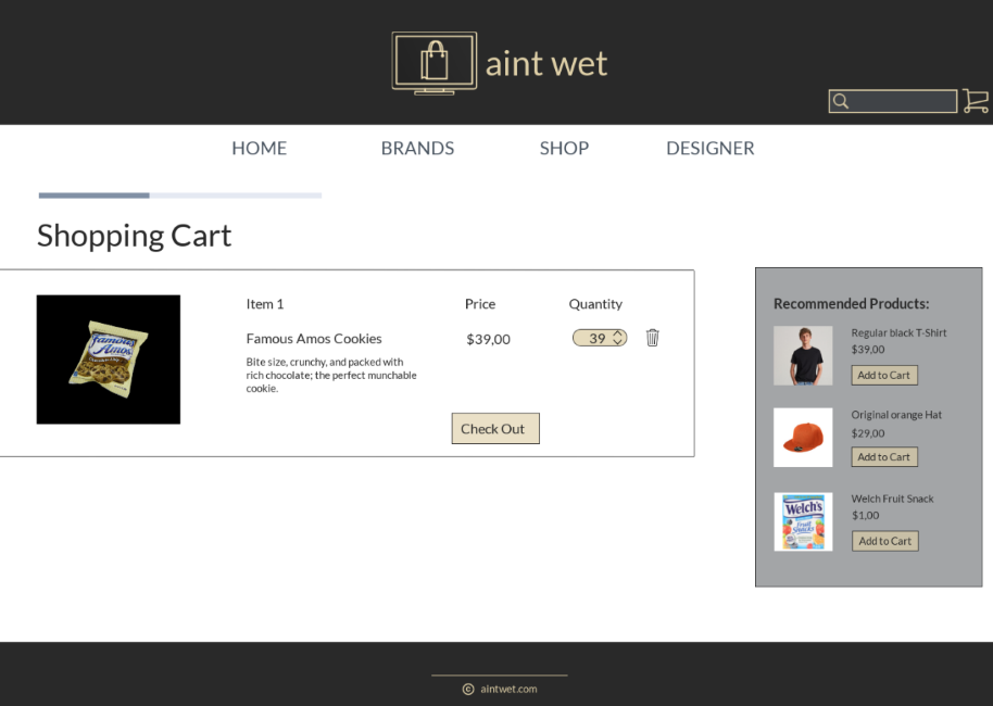
The chosen products are in the form of a list. There is also the amount of the product under the quantity. We removed the big red cancel button altogether. Instead, there is a delete icon for removing unwanted items from the cart.
Conclusion
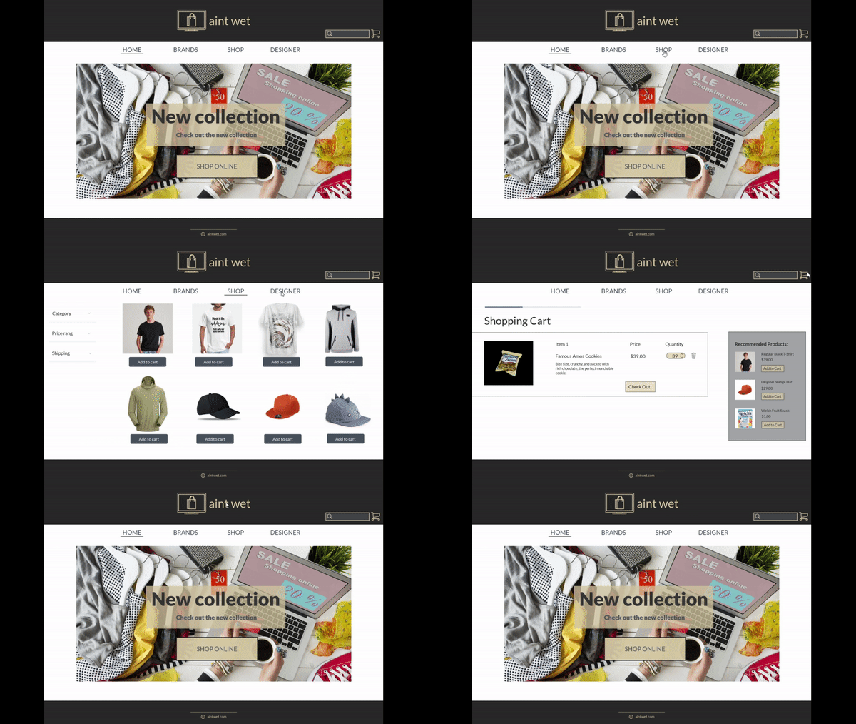
After finishing the redesign, we believe the website was more user-friendly. Our designs are far from perfect, but the goal was to identify the biggest problems with the original page and create a solution. Therefore, our solution reached that goal.
What I learned from this project
This project had the purpose of teaching us time management and prioritizing issues. It also taught us the importance of dividing tasks evenly.
What would be the next steps
The project ended with those three redesigned screens. However, the next logical step would be redesigning the remaining pages of the website and including them in the prototype.
