Project Summary
I was the sole designer on this project which required designing a business card for a Freelance Android Developer. The task was to create a design containing important information and to fit it on a small 2.75" x 1.10" card.
Research
The first step was to research popular business card designs. For inspiration, I used Pinterest, Dribbble, and Behance. Then I jotted down the information that needed to be on the card:
- name
- website
- occupation
- google developer profile
- area of specialization
- photo
- personal logo
After that, I did several brainstorming sessions on occupying as little space as possible with the above information.
Tools applied in the project
I created the whole design in Adobe Illustrator and used Adobe Photoshop for removing the background of the client’s photograph.
Final Design - style guide
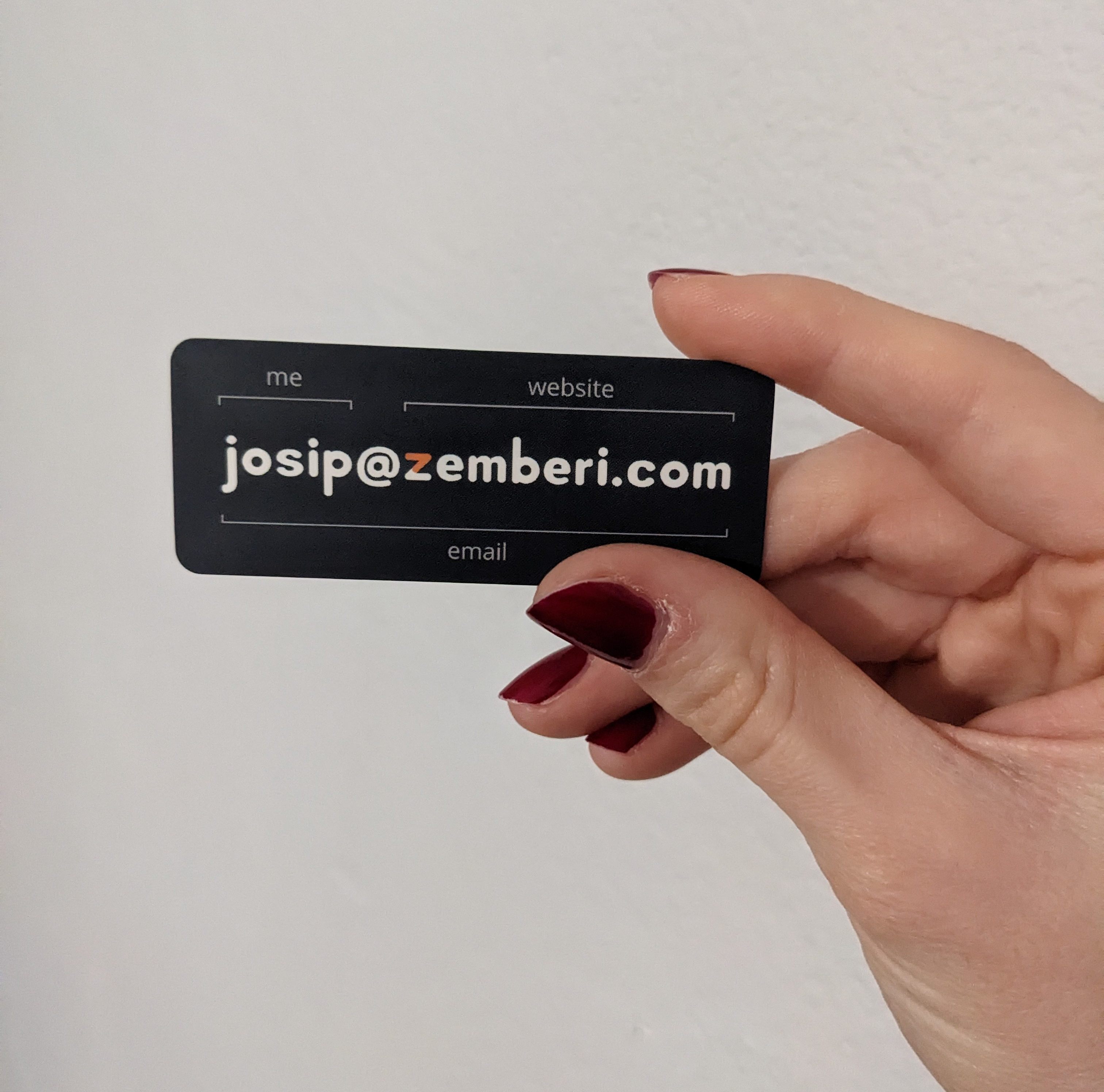
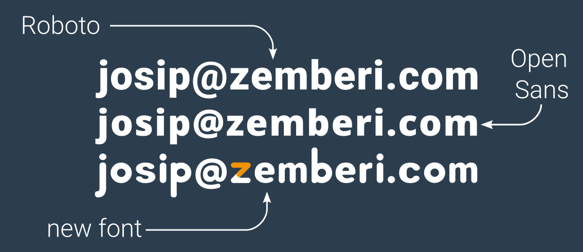
I used colour theory principles when choosing the colour for the cards. Due to the use of orange in the logo, I chose a dark blue shade for the background to make it pop. The combination of the <> signs in the logo creates a Z. It has rounded corners, so the idea was to create a matching rounded font for the card. For that, I drew inspiration from Roboto and Open Sans fonts.

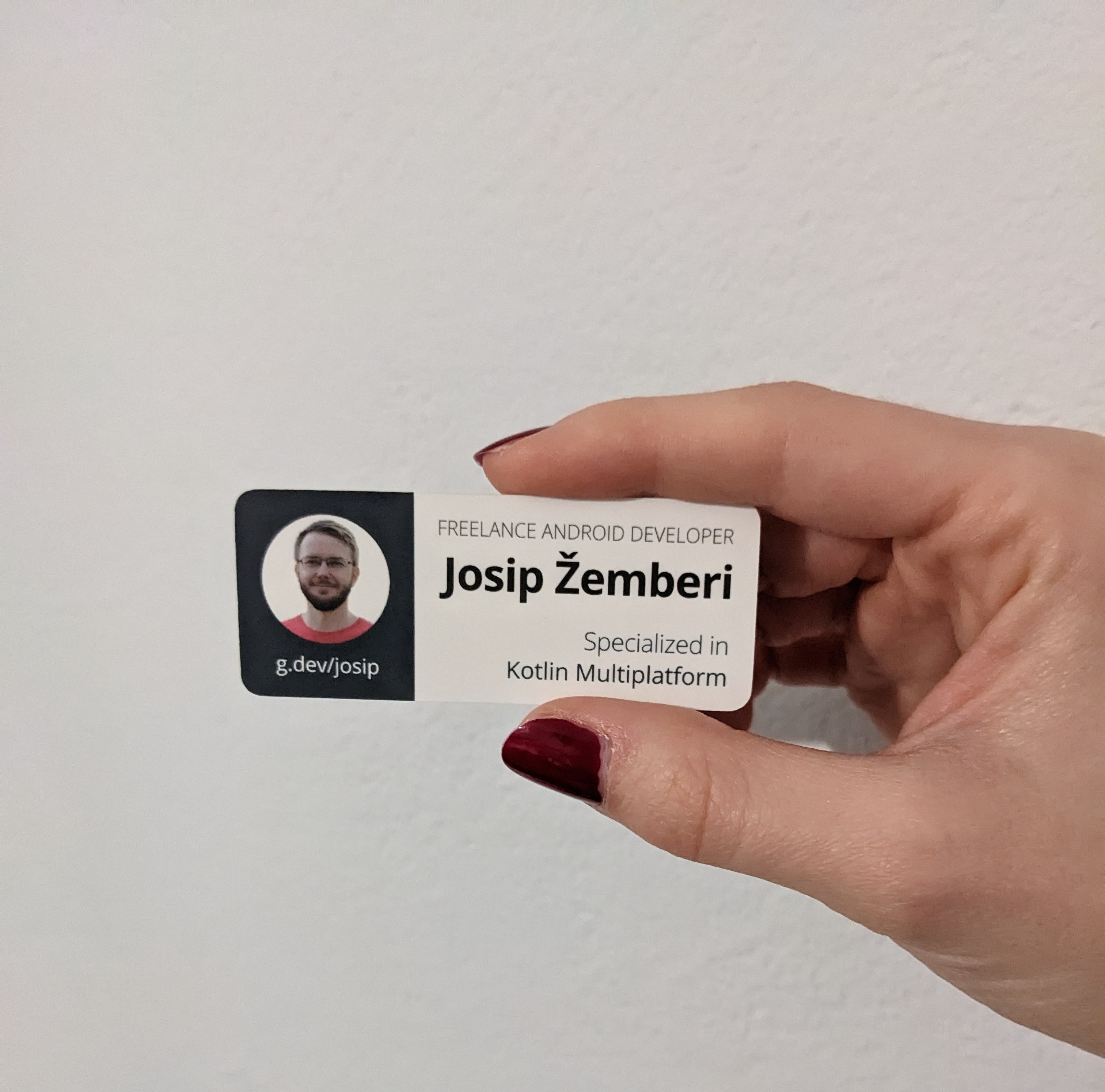
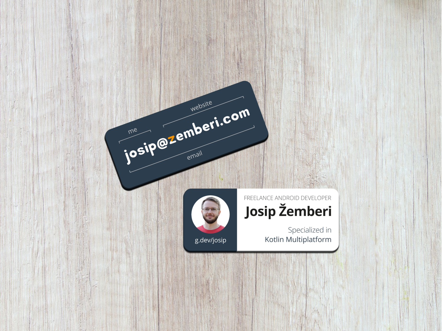
Occupation, area of specialization, photo, full name, and google developer profile was left to put on the back.
After removing the background, I also rounded the photo in a circle. Circles are considered perfect shapes. They are also popular on social media for showing profile pictures. For the background behind the photo, I chose the same shade of dark blue. Below the picture is the link that leads to the client's google developer profile.
Then on the right is a larger space with a white background containing other information. The occupation is written in upper case, thin font. Below, equally distributed but in a bolder font, is the full name. And then, in the right-bottom corner is right-aligned the area of specialization.

Arranging elements this way left both sides of the card with enough negative space. In the end, that's what gave them a nice, clean look.