About Project
dateo is a reminder app currently being developed for both Android and iOS platforms. I am the sole designer on this project, collaborating with the developer.
Introduction
Material Design is an adaptable system of guidelines, components, and tools that support the best practices of user interface design. Backed by open-source code, Material Design streamlines collaboration between designers and developers and helps teams quickly build beautiful products.
Material 3 Design Kit & Material Theme Builder plugin have jumpstarted the creation of this design system.
Purpose of the design system
- cohesive and consistent design language
- more efficient collaboration between designers and developers
- speeding up the design process
- maintaining a consistent visual brand across all platforms and devices
- designing all components and elements with accessibility and usability in mind
Design Principles
While developing this design system, I followed Material 3 Design System principles:
- Consistency - All UI components and visual elements are consistent across all platforms and devices.
- Simplicity - Simple and clear design language makes it easy for users to understand and use the app.
- Accessibility - High contrast colours and clear typography ensures text is legible for users with visual impairments.
- Flexibility - Easy customization of UI components.
- Modularity - Modular components allow easy reuse and modification of individual elements.
- Clarity - Clear and concise language and visual cues for easy navigation.
Branding Guidelines
Logo usage and guidelines
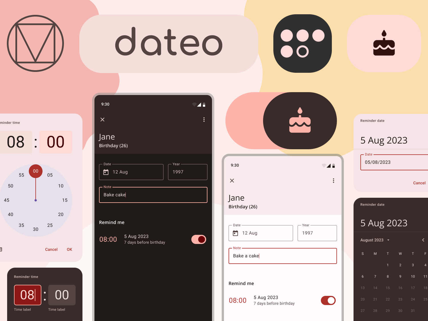
After trying different options for the colour of the app icon, I settled on red.
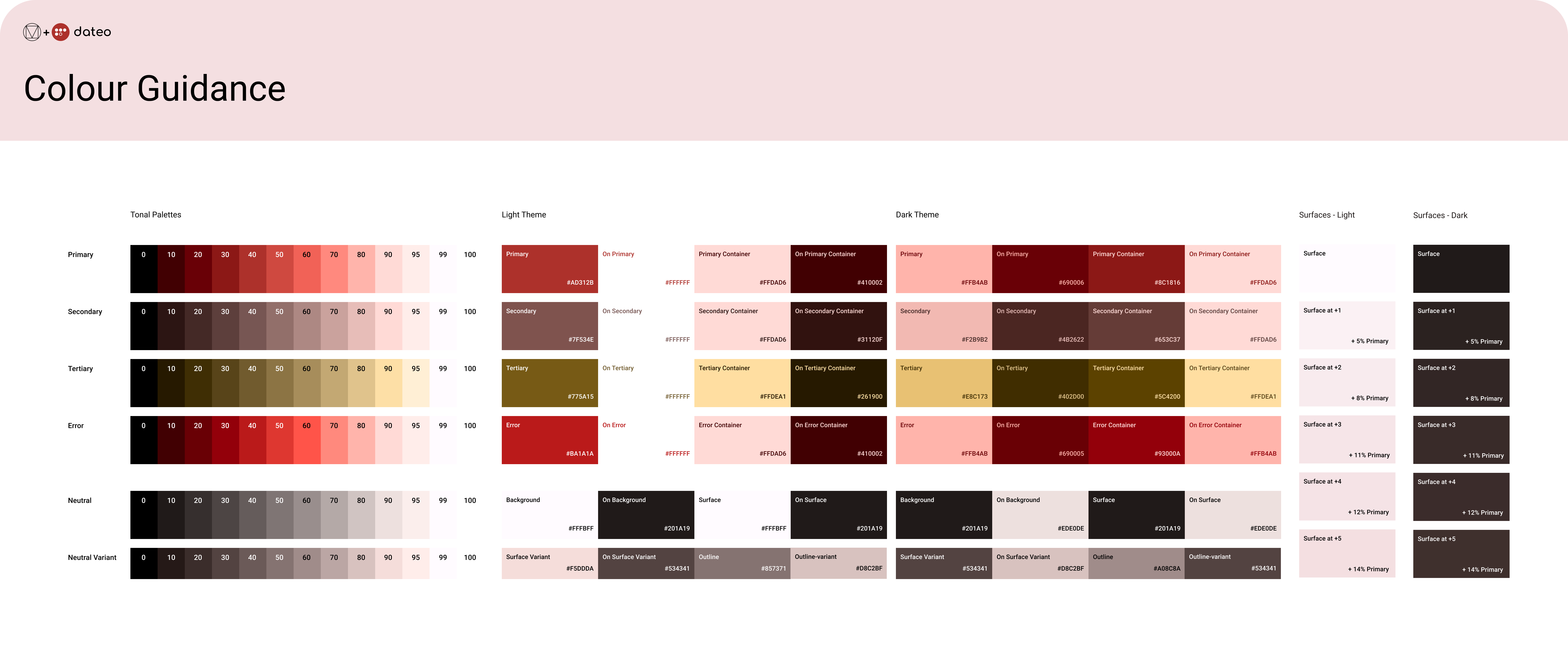
Red is an attention-demanding colour, and dateo's purpose is to remind users about the dates that are important to them. This exact shade of red is also the primary colour for the light theme (hex: #AD312B).
I chose white for the icon foreground because it makes a good contrast.
The icon contains five circles, four are full circles, and one is an outline. The circles abstractly represent the letters of the name of the app. Their placement also makes them resemble a calendar.
Monochrome icon
Material You, with the Android 12 update, introduced themed icons. Themed icons match users' wallpaper colours and make their phones look more personalized. To enable the themed icon for dateo, I designed a monochrome icon.

Figure 3 shows an example of how it looks in several themes, both in dark and light mode.
Colour palette
dateo is a reminder app. Its purpose is to notify the user about dates that are important to them. When thinking of notifications, the red colour comes to mind. I used a pastel shade of red (hex: #EE6055) and the Material Theme Builder Figma plugin to generate this colour palette.
Typography guidelines
For the app name, I used Comfortaa bold font designed by Johan Aakerlund. Comfortaa is a rounded geometric sans-serif type design intended for large sizes.
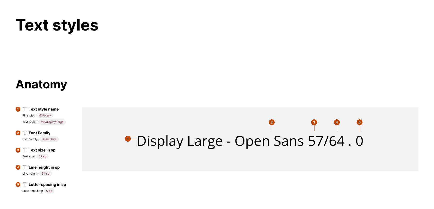
I used Open Sans and Roboto font pairing for this project. Open Sans and Roboto are both sans-serif fonts with similar proportions, making them harmonious when used together.
Open Sans is a popular font designed by Steve Matteson, and Roboto is a font designed by Christian Robertson specifically for the Android operating system.
They are both highly legible and have excellent clarity. Roboto's slightly more condensed shape looks better in small font sizes, whereas Open Sans makes big headings look more modern.
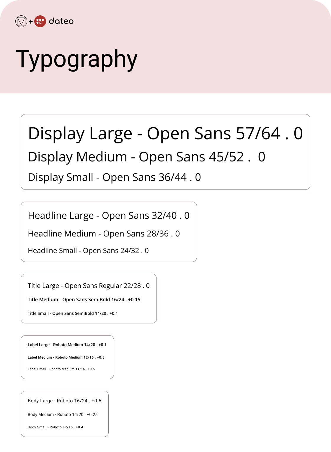
The numbers following the text style's name and font family are text size, line height and letter spacing expressed in sp, as shown in Figure 8.
Iconography guidelines
All icons used in the design are Material Design icons. For now, there are no custom icons. However, if the custom icons become necessary, they will be designed following Material 3 Design principles.
UI Components
Material 3 offers a variety of UI Components. Below are some of the components I used and modified to be better suited for dateo so far. The documentation is not yet final because this process is still underway.
The most important thing about this part of the design system is that the UI components, as well as consistent, are:
- well documented
- reusable
- easily modified
Date pickers
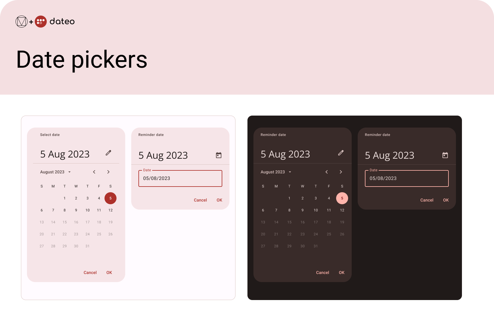
Date pickers let users select a date. dateo uses a modal date picker and modal date input. That way, users can choose between the date picker and inputting a date into a text field.
Time pickers
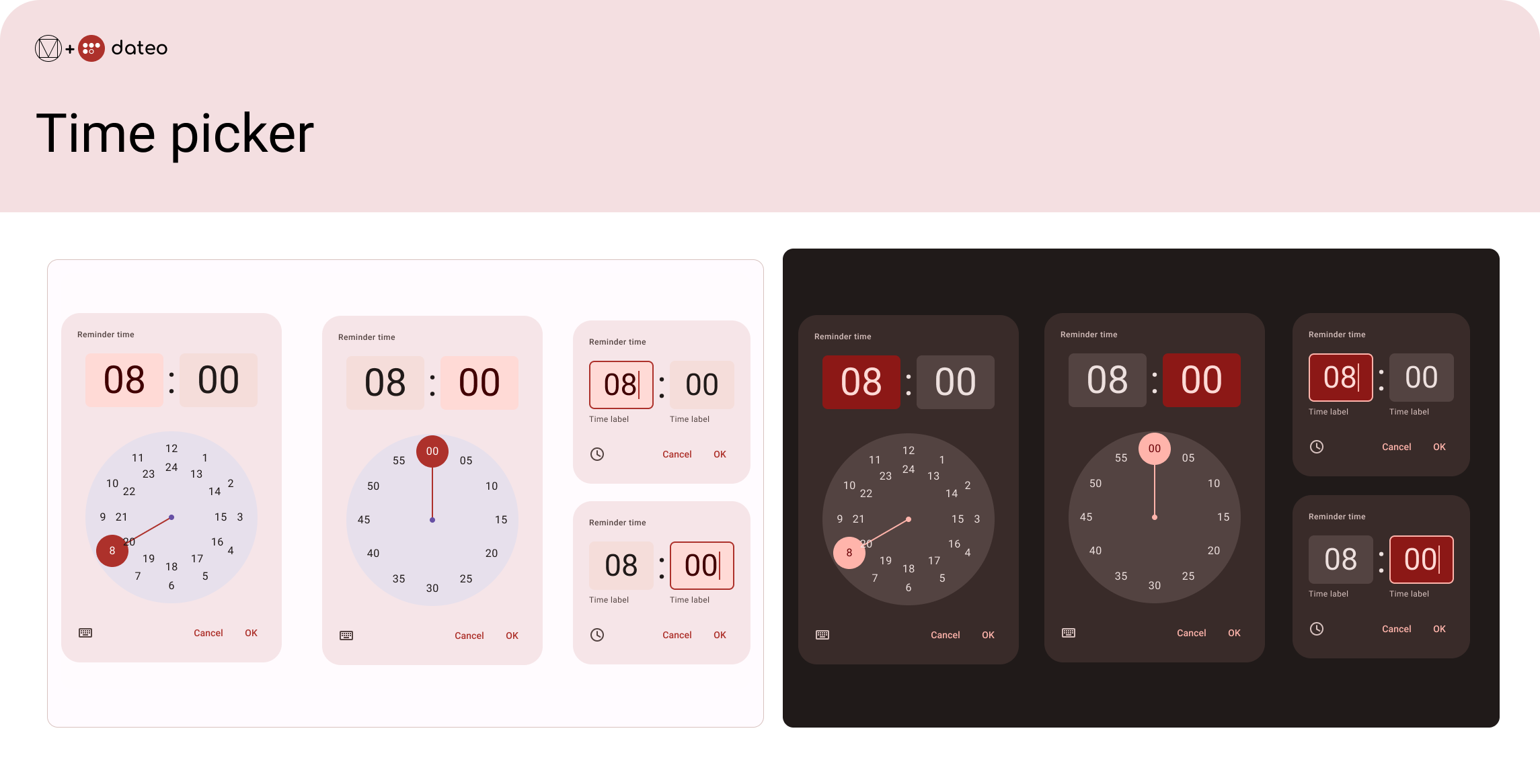
Time pickers help users select and set a specific time for their reminders. There are two types of time pickers: dial and input.
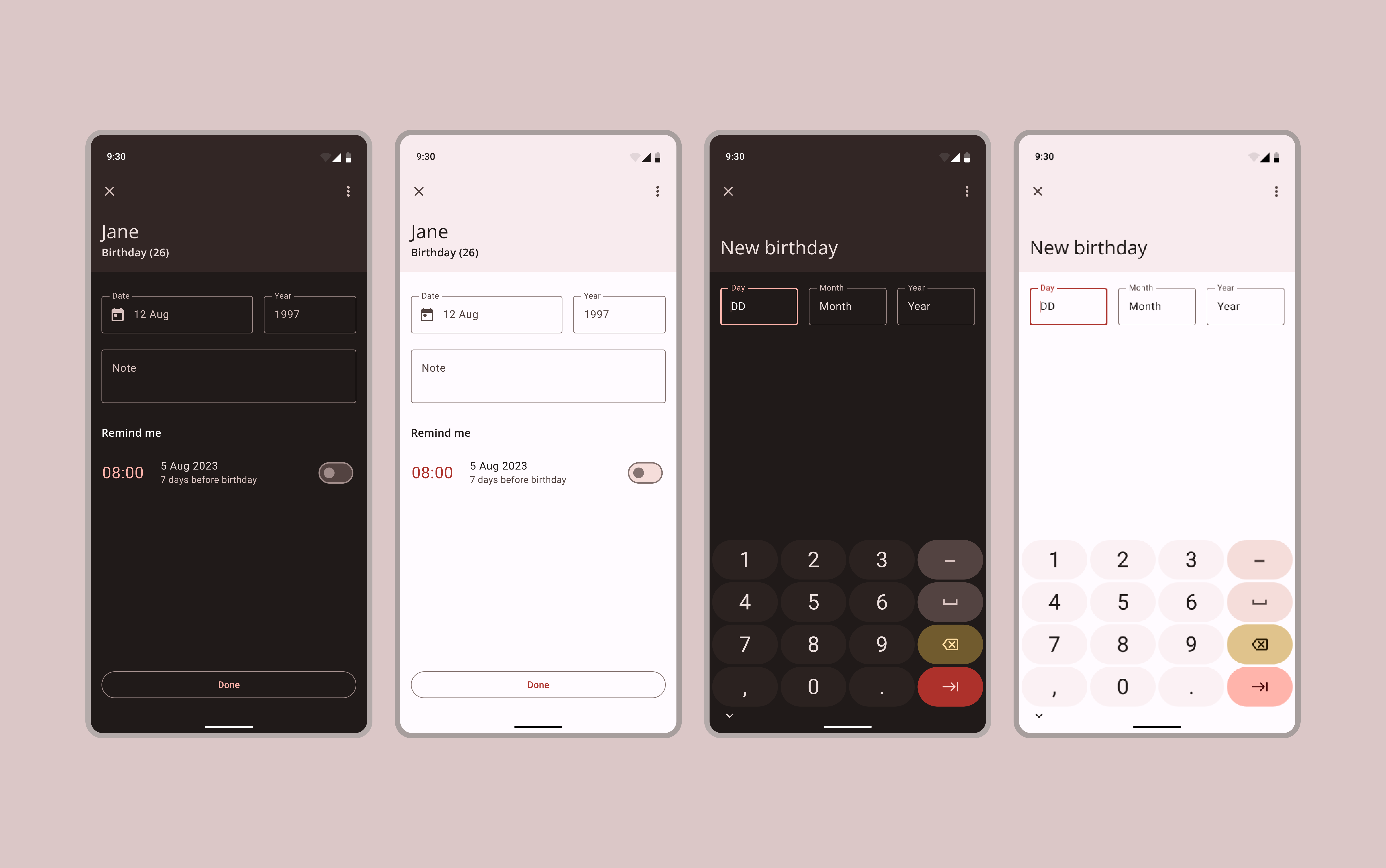
Text fields
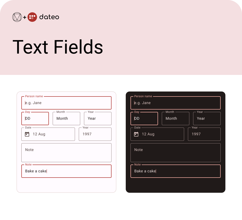
For dateo's purposes, I chose outlined text fields. They stand out and inform the users which information they should input when adding a new birthday or when they are editing it.
Lists
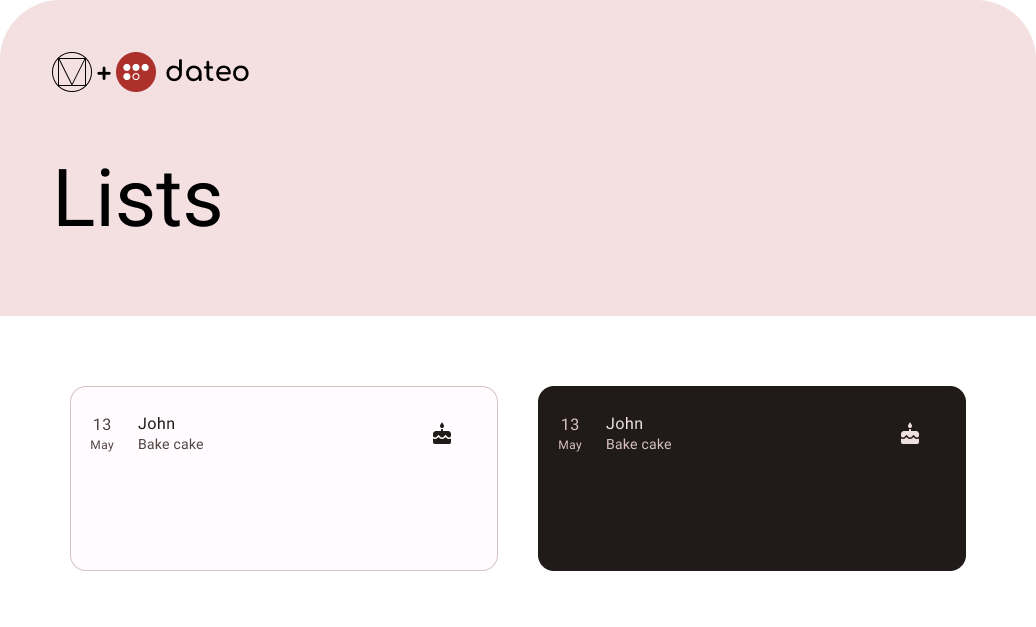
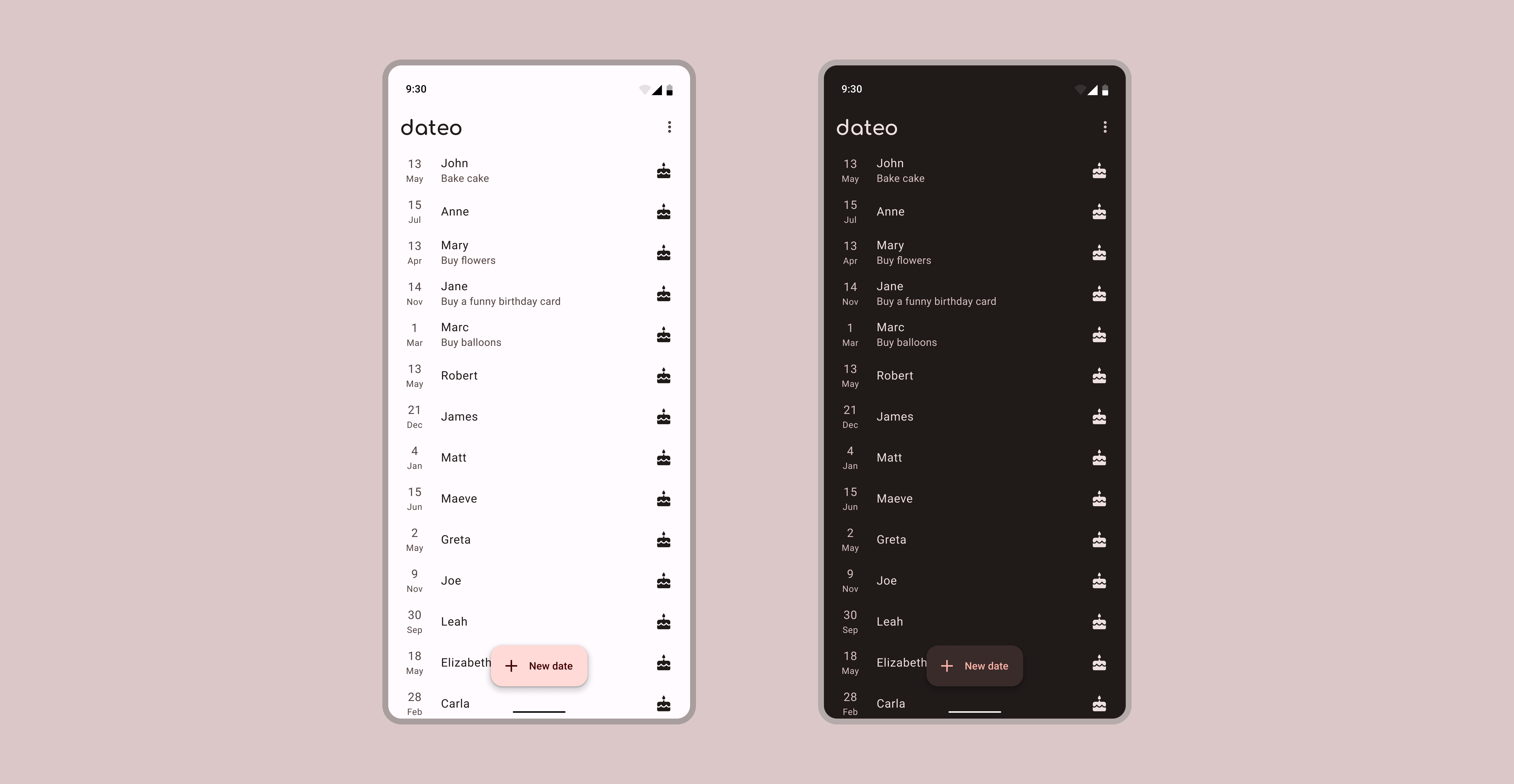
dateo's home screen displays the list of entered dates to remember. Each list item consists of the date, person's name, and note if there is one. It also shows a material design icon of a birthday cake.
Accessibility Guidelines
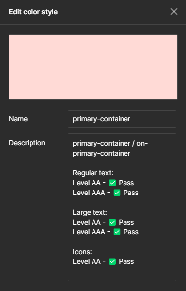
Like Material 3, dateo design system follows accessibility guidelines to ensure that its components are usable and understandable by all users. These guidelines include ensuring that components have proper labeling and focus management and providing appropriate colour contrast.
Figure 15 shows an example of checking the colour contrast between the "primary-container" colour and the "on-primary-container" colour.
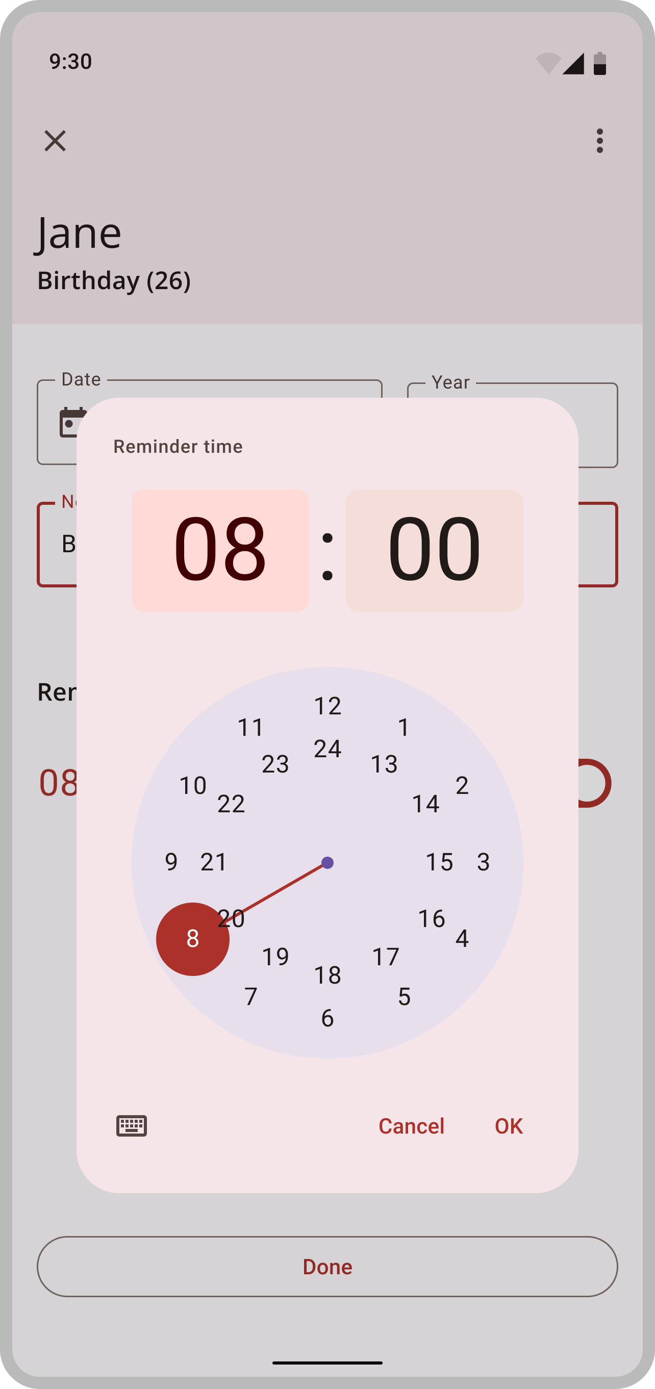
Furthermore, the focus management is visible in Figure 16. It shows the screen where the user chooses the reminder time, and the focus is on the pop-up clock.
There is a darker shade covering the background to accomplish that effect. But the shade is not too dark, so that background can still provide context.
This screen can also be an example of proper labelling. In the upper left corner of the clock, it says what the user is choosing - Reminder time. In addition, the standard "Cancel" and "OK" buttons are in the lower right corner.
Conclusion
This design system is still an ongoing project. The app is under development. There are still plenty of things to design, modify or tweak. While creating this design system, I followed the Atomic Design guidebook. Because of that groundwork, further work and needed modifications should be easier to complete. Hopefully, that will also help this design system stand the test of time.
