Roles in the project:
I was in a team with two other people. It was our first design project and everyone had the same amount of responsibilities.
They consisted of: ideating, market research, user research, identifying user pain points, creating user personas, making a blueprint, wireframing, UI/UX design, prototyping and usability testing.
There were several business meetings with the pretend buyer, and in the end, we presented the finished product in a form of a prototype.
Project Summary
Problem:
Design an app that connects nannies with parents who are looking for them.
Since there were two types of users, we needed to identify pain points for each of them and also do two user researches.
Goal:
Design the app in a way that both types of target users would want to use it.
Who are the users?
There are two types of target users:
- parents in need of babysitting services
- nannies.
In this step we also made Value Proposition Canvases and User Personas for both types of users.
Market & User Research
After roughly defining the users of the app, the next step was to research the market as well as the users.
Key takeaways from 10-pages long research:
- There were no similar apps in Croatia at the time so there wasn’t a lot of competition.
- There was a website that provided a similar service, however it was a bit difficult and overwhelming to use because of the other many services it provided. Website in question: babysitter.hr
- From the report found on the Bureau of Statistics Republic of Croatia webpage
there was important information about the families in Croatia.
Although conducted in 2011. (it was the latest population census at the time), it still revealed a lot of valuable information that helped us paint a picture about the possible user pool: - the total number of families with children was 867,680
- there were more families with fewer children (one or two)
- the total number of families with children in school was slightly more than half of the total number of families with children
- there was more single mothers (174,517) than fathers (33,345)
- On the Internet we found out there is a lot of nannies that are in search for a job on social media platforms and advertisements.
- There is a Croatian association of nannies ( HUD ) whose members could potentially be our users.
Tools used in the project:
- Marvel
- Balsamiq
- Figma
Sketches & Wireframes
The tasks of sketching, wireframing, graphics and prototyping were divided equally among the team. Each person had to do the same number of screens and graphics were discussed later.
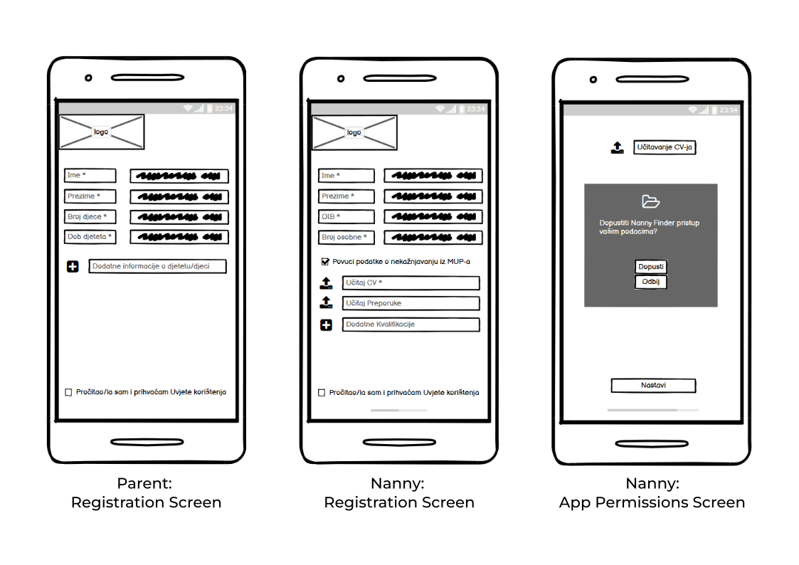
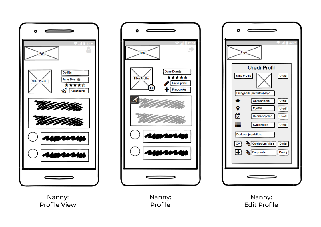
Below are shown some of the low-fidelity wireframes.
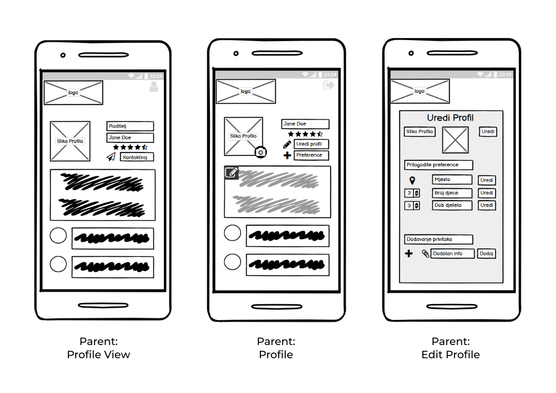
After showing the research, wireframes and presenting the first phase of the project, we gathered feedback from the client. The next step was to factor in the feedback and turn the low-fidelity wireframes into high-fidelity.
Style guide
Since the main aspect of our app was caring for children, we styled it accordingly.
We used bright colour tones, and made a cheerful app icon that would correctly depict the theme of our app.
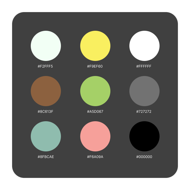
Below is the color system. It consisted of the colours that are visible in the app icon, along with the shades of black, white and grey.
First final design
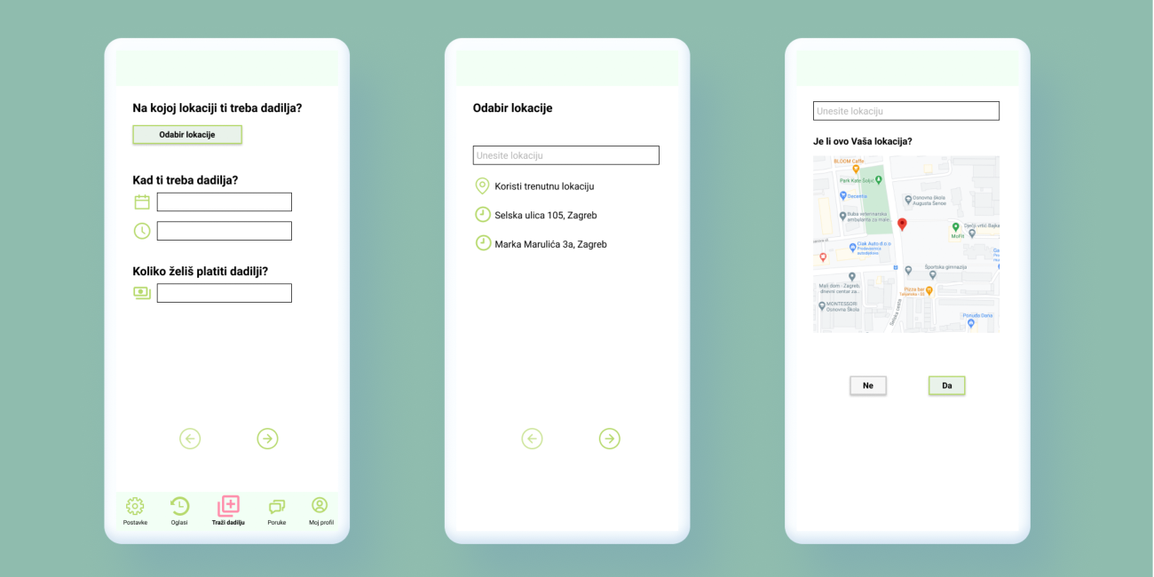
Following the above mentioned style guides, we crated the following designs:
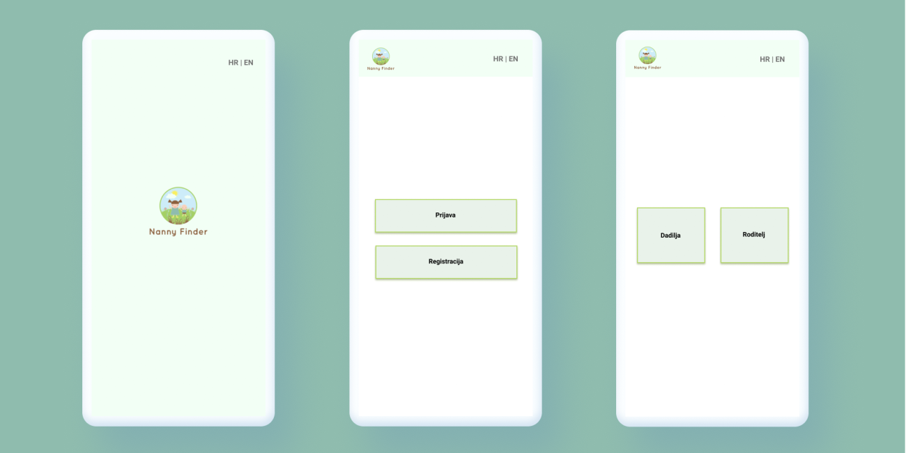
The first screen is the launching screen, after which you can either log in to an existing account or register a new one. After choosing the log in option, you are proceeding to the log in screen where you enter your credentials. If you choose register, then you're moving on to the screen to choose a role between being a parent user or a nanny user that is shown above.
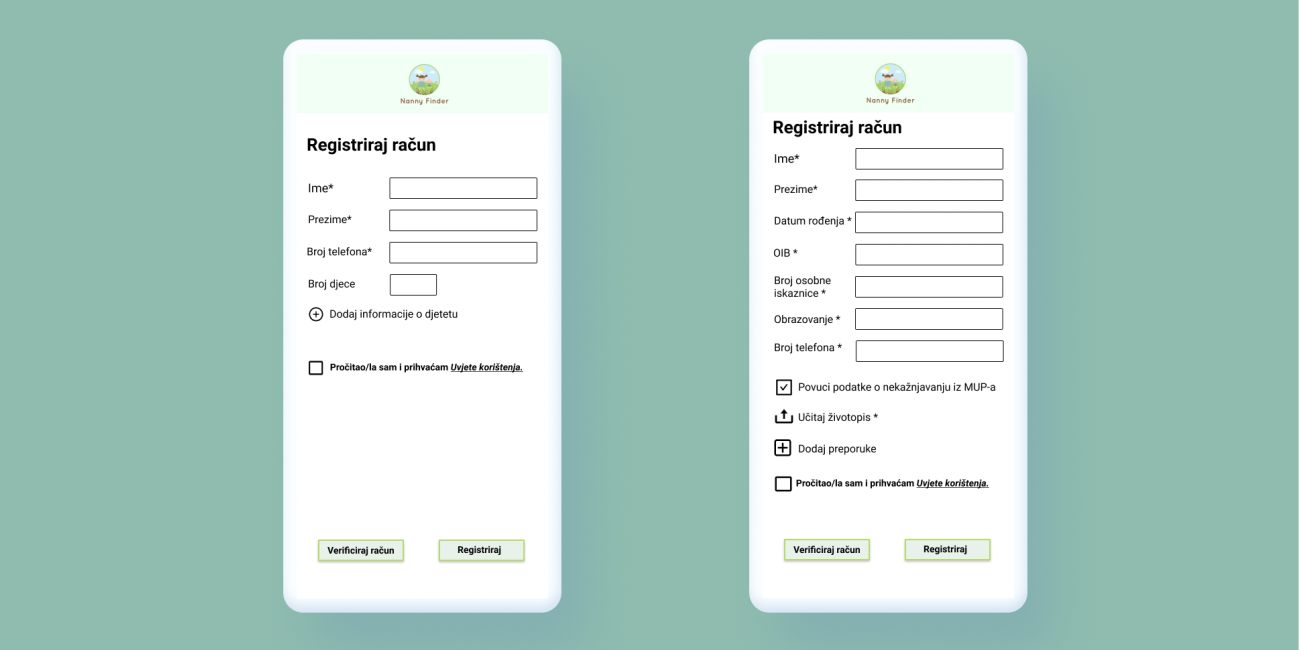
Depending on your role of choice, you are faced with a different register screen. If you chose to be a parent user you need to enter basic information about you and optionally some additional information about your child/children. On the other hand, if you choose to be a nanny user to register your account you need to enter a bit more information. You also need to give consent for a police registry check to prove you don't have a criminal record. You need to upload a resume as well. There is also an option to add recommendations.
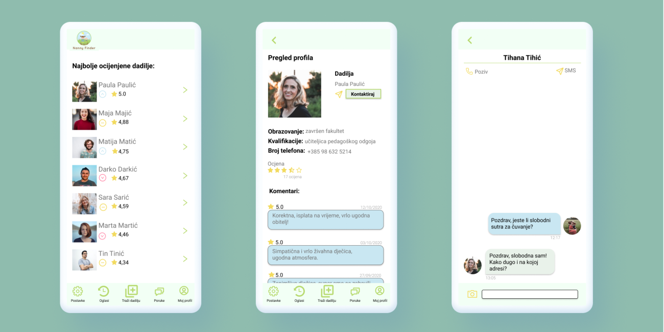
If you are a parent user the first screen you see shows the best rated nannies in the app. You can click on them which will lead you to their profile. Their profile has information about their education, qualifications, comments of the previous employers and such. You can also click to contact them which will open a message conversation that is available inside the app.
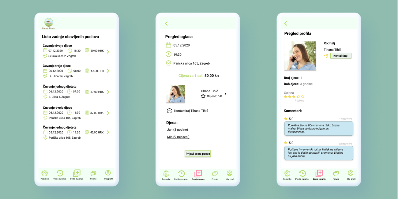
However, if you are a nanny user your first screen after logging in will be the latest job ads. If you click on an ad, you can see its details as well as the parent who wrote it. Before applying to the job, you can check their profile to see the previous experiences other nannies had. You can also contact them for additional information.
Results and takeaways from usability tests
After finishing the prototype and testing it ourselves, we conducted usability tests by writing possible scenarios.
Each scenario began with an instruction, i.e:
You are already a registered user in the role of a nanny. You’re interested in seeing your messages. Try finding them and opening the first conversation.
Followed by a series of statements that the tester would rate from 1 (Strongly disagree) to 5 (Strongly agree) and a place to write additional notes if they felt necessary.
Each team member wrote circa five scenarios and each was successfully executed by two or three external testers.
Conclusion
NannyFinder’s purpose was to act as a middleman between babysitters and parents in search for them. Since children are extremely vulnerable, parents would be reluctant to hire complete strangers to care for them.
To solve that problem, there was a mandatory check in police registry before registering the nannies and making them eligible for work. The nannies also had profiles where parents could find resumes, ratings and such. That made them feel more safe.
The impact we wanted to make with this app was to help nannies in finding jobs and to help parents in finding nannies.
Next steps
The next step would be to make the app available in English language to enable non-Croatian speakers to use it. However, from designers perspective, the next natural step is to design a design system for dark mode theming.
But even more important next step would be to get more user feedback.
Just like every other app’s first version, there’s always room for improvement. There might be some additional feature that our users would want to use. There could also be some unforeseen problems that could affect the users experience. Such as too many number of clicks to complete a task, or bad error handling.
What I learned from this project
This was my first UX design project and it helped me learn the importance of user experience. It also taught me a lot about the design process and all that it contains.
